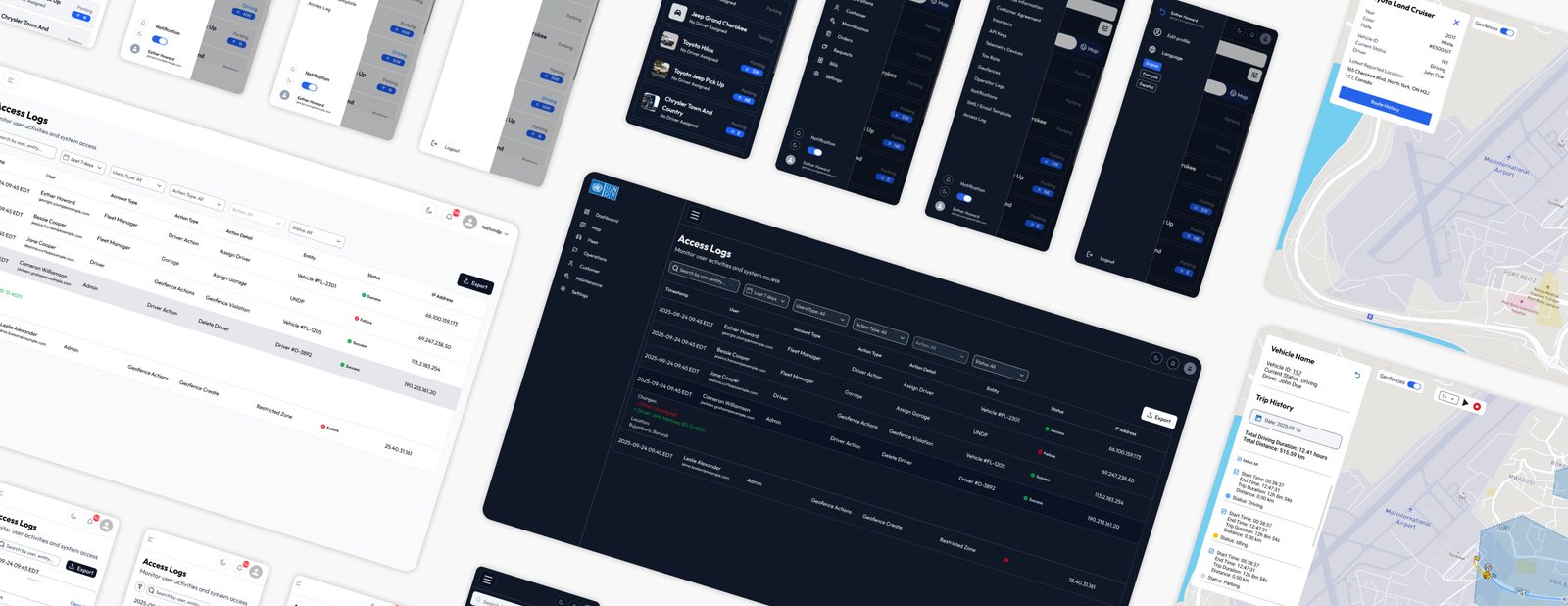
At Shift Technologies, I contributed to a fleet management SaaS platform used by fleet managers, dispatchers and admins to monitor vehicles, manage operations and control data access, and serving high-stakes global organizations like the UNDP and Air Canada. My core mission was to bridge the gap between heavy backend data and user intuition by creating clear, scalable, and highly usable digital designs.
What I delivered
01
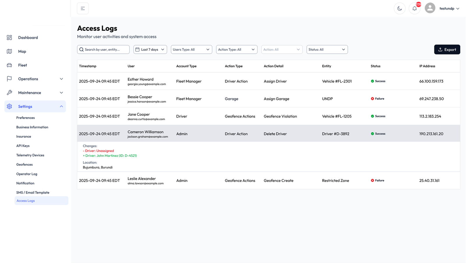
Access log
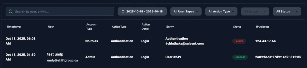
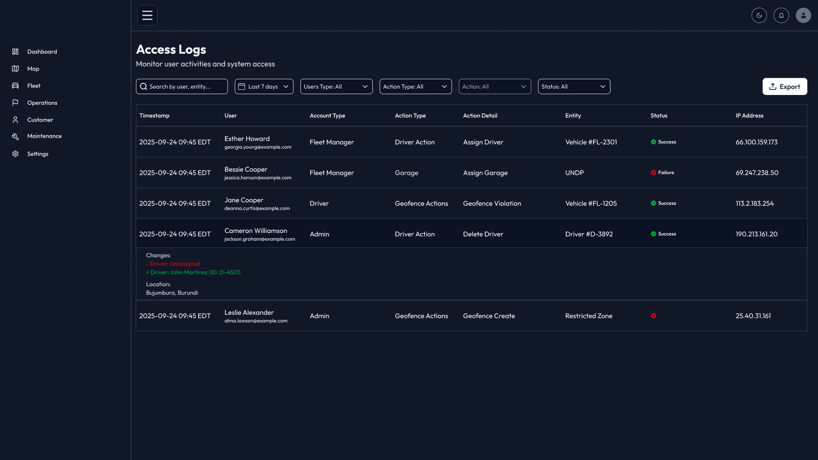
A new feature that lets admins audit who accessed security-related data.
02
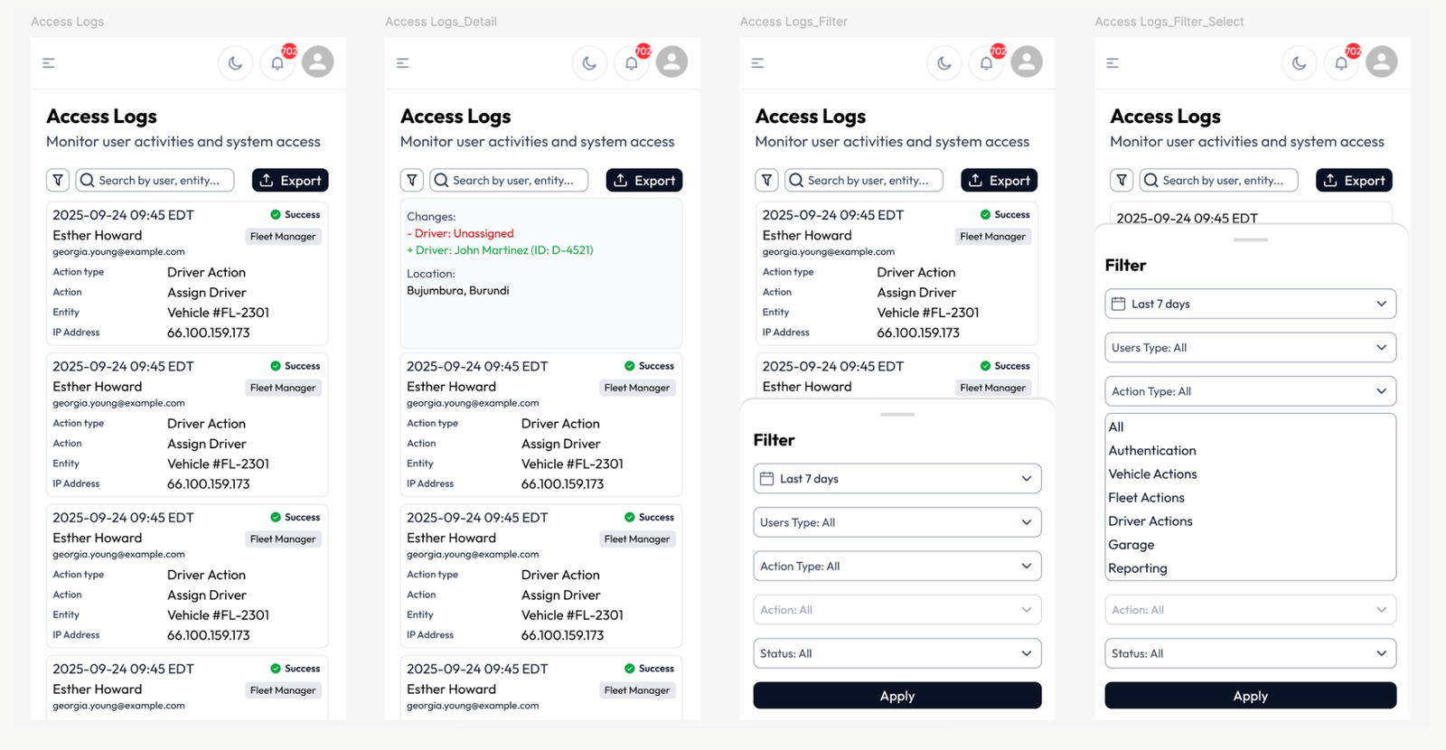
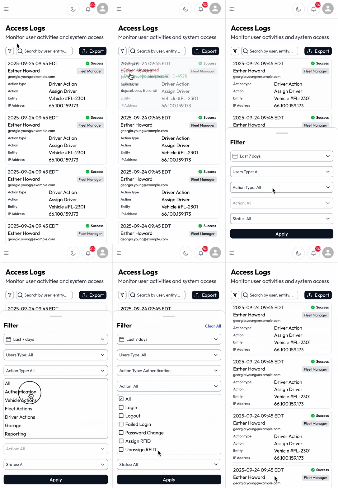
Responsive mobile
Access log table reworked into cards and a bottom-sheet filter.
03
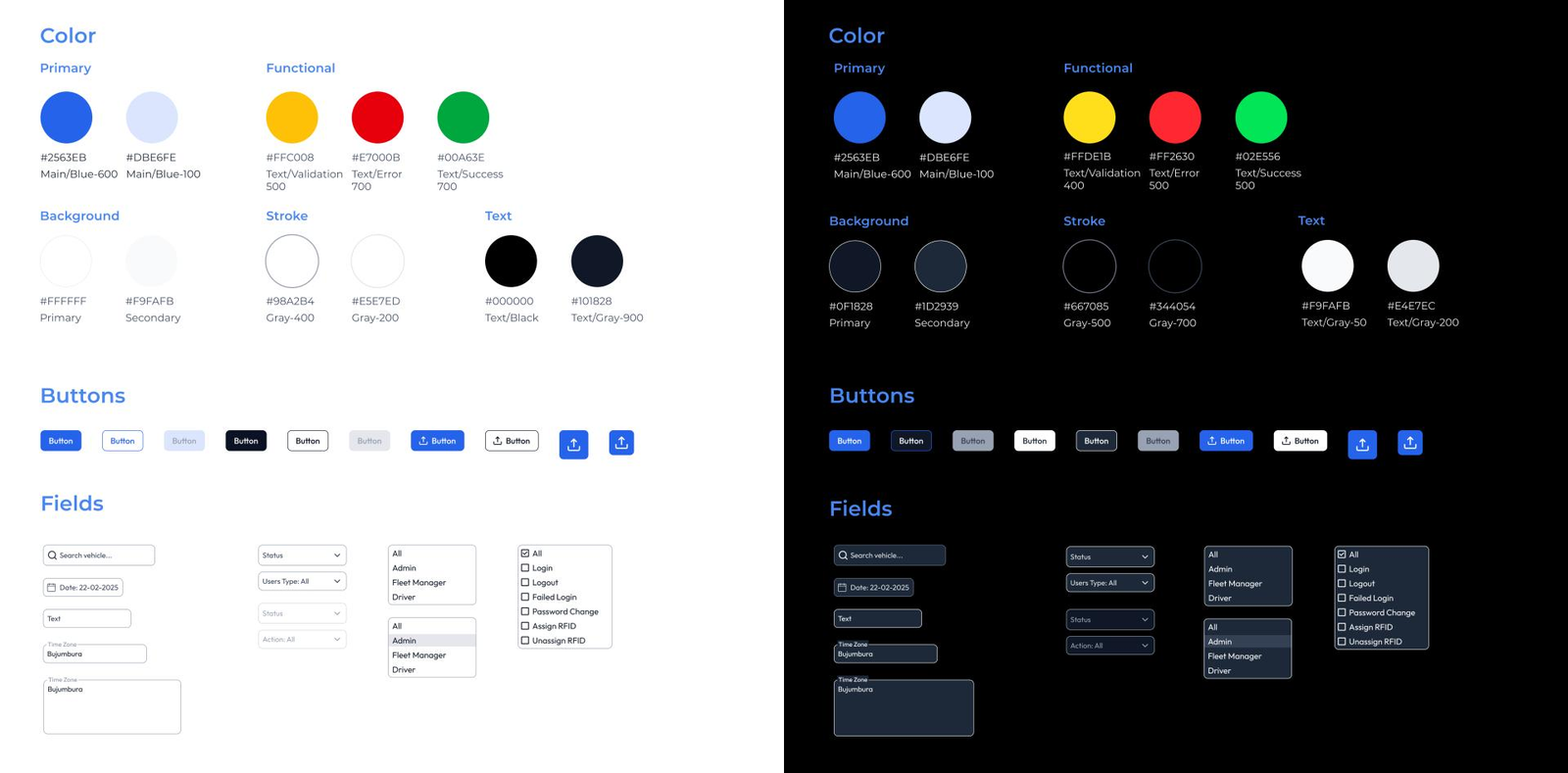
Dark mode & style guide
A shared visual system with light and dark themes.
How I worked
PM + developers discuss a change → Ticket created → I design → Developers build
01 - Access Log
Giving admins a clear audit trail
The platform already let admins assign roles and permissions to drivers, admins and fleet managers, but there was no single place to see who had viewed or changed sensitive data. For clients such as cash-in-transit and fuel-transport operators, this kind of audit trail matters. When something went wrong, or a client asked who had accessed their information, there was no easy way to answer.
How I approach?
Step 1: Understanding the requirement
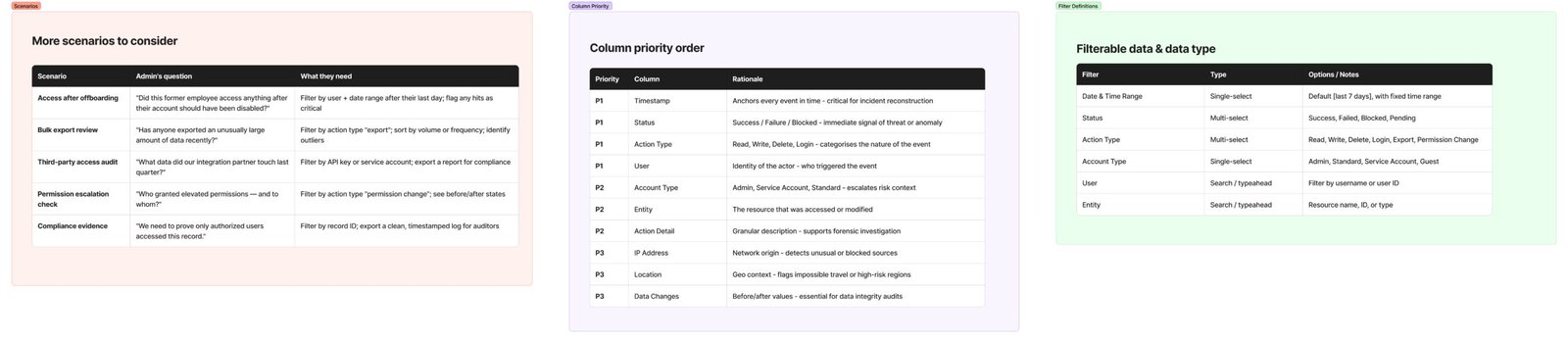
Step 2: Defining use scenarios
Step 3: Prioritising information
Step 4: Designing the table
Step 5: Defining the filters
02 - Responsive Design
Fitting a 8-column audit table on mobile
[Table → cards] Each log entry becomes a card showing the must-show fields [Filters → bottom sheet] Filters stay usable without crowding the screen [Hidden Data] Low-priority data is only displayed when clicked.
03 - Style guide and dark mode
Finding UI Debt
While working on these features, I kept finding different colours, text styles, spacing and components across the platform, and dark mode was the most inconsistent part. Each new screen meant deciding on styles again, which slowed down both design and development. This showed me the platform needed one shared reference instead of more one-off fixes.
Dark Mode Style Guide
I created a style guide covering colour, typography, spacing and components such as buttons, inputs, dropdowns and tables. Every colour has a matching light and dark value, so developers can switch themes without redesigning screens. The type scale uses Outfit, with separate sizes for desktop and mobile, so text stays clear and consistent on every device.
Dark Mode Design and Accessibility
For dark mode I used dark grey instead of pure black to reduce glare, with slightly lighter surfaces to show depth for cards and menus. Status colours were brightened so they stay visible on dark backgrounds. I followed WCAG 2.2 AA guidelines: at least 4.5:1 contrast for normal text, 3:1 for large text, and 3:1 for buttons, icons and focus states. For example, white text on the primary blue button reaches 5.17:1.
What I learned
Finding the real problem behind a request.
The screenshot on the Jira ticket shows what to change, not why. Asking the right questions shaped better solutions.
Designing within technical limits.
Working with the existing tech stack taught me to balance ideal UX with what developers could realistically build.
Thinking in systems.
Fixing individual screens showed me the value of a style guide in preventing the same problems from coming back.